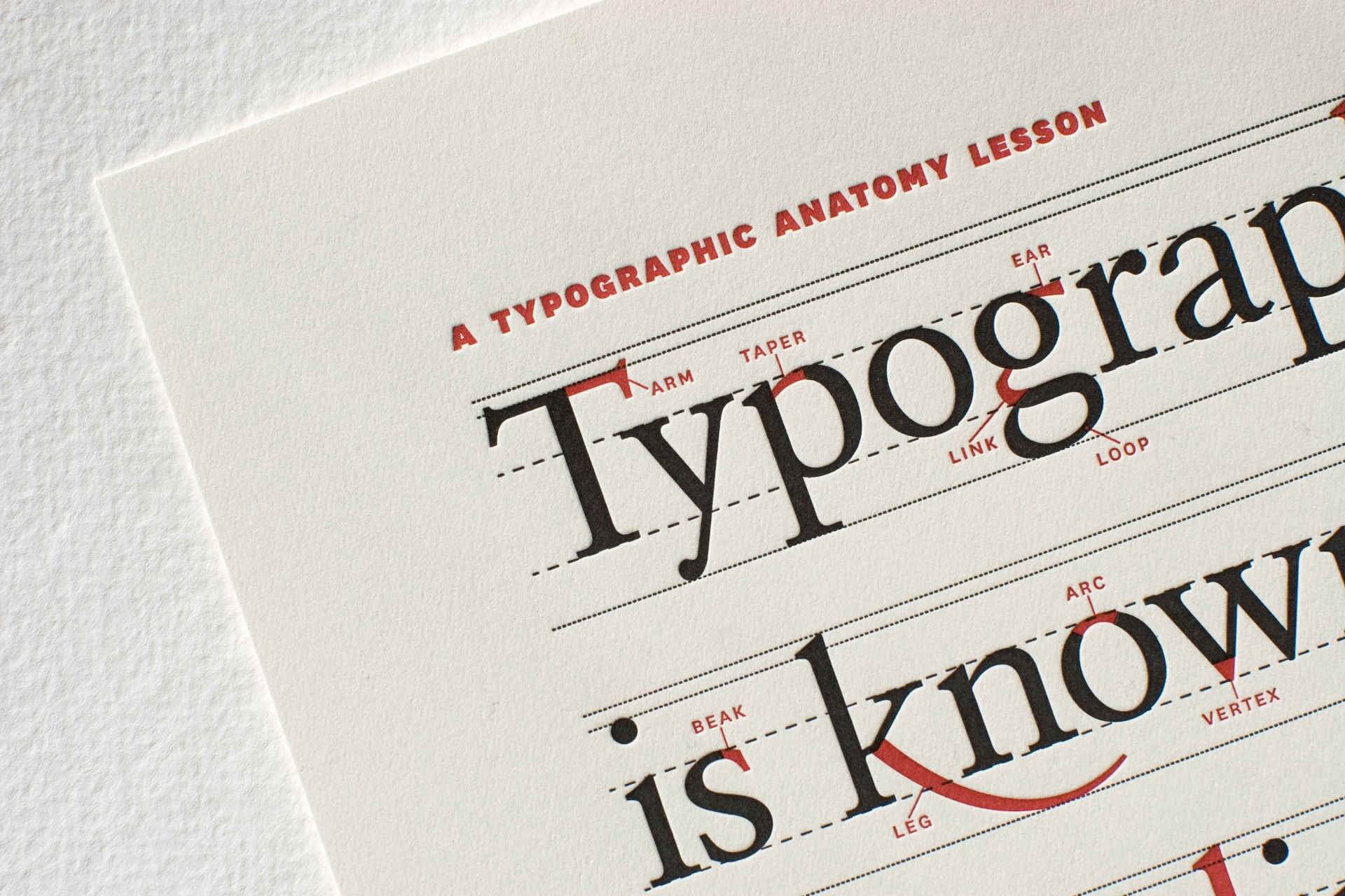
Typography is a critical part of the design, but unfortunately, it is not always well planned out. You can create excellent exemplification, pictures, and other graphic content but if the typography of your design is not good on your products, it could easily turn off potential buyers of your products and services In this article we discuss Why Typography is important in branding.
When we consider typography, it is not just about selecting and using a particular font, all typographic elements should also be arranged correctly in your design, the visual arrangement, the color contrast, the blank space, the fonts selected, and size of the font. Every typographic element impacts your design on both macro and micro stages.
In simple words, typography is the style and way of presentation of the text. When a company is developing a brand identity, a persistent type of font should be used, each with a particular reason. Typography enables you to create a particular context and have a certain personality. It can be modern, vintage, romantic, shy, or rigid just by selecting an appropriate typeface and creating it correctly. Work on your typography so that it helps you to express the personality of your brand. A professional logo designer can help you to create appropriate typography that can help your brand in the promotion.
Typography impacts experiences
Individuals perceive your brand through words in various situations. Whether they are seeing a message on your tv advertisement, viewing your website page, or having a look at the name of your product, it’s an experience for a customer. Branding is the experience customers have with your business, so to have a positive brand image it is important to provide a positive experience to customers through your products or services.
As per Nielson stated, web users have the topmost complaints about small font sizes and poor contrast while reading on the digital medium and we have surely experienced the difficulty of trying to read small text. This is considered a small and insignificant typographic errors lead to poor customer experience and therefore a negative impact on your brand.
Typography has meaning
Typography represents the tone and values of your brand just like colour represents a feeling or visually represents a message for your customers. Every category of the font has a different meaning and thus will portray a different representation of your brand and what your business stands for.
The purpose of having several categories of the font is that they all have a vastly unique effect or tone. For instance, sans-serif fonts are typically advanced looking. They are usually clear, easy, simple to read on a big scale, and perfect for several things today. However, serifs seem outdated, look conventional, and give an older feeling, but they are considered easy to use for the longer type of content which includes blogs and books.
Monospaced fonts are usually used in computer programming and coding, so they are likely to give a feeling of technology to your design. Script font seems handwritten and personal but can differ from cute, modern brush lettering, to pretty elegant, stylish calligraphy. Blackletter is linked with the gothic era and thus feels dim, nasty and a bit moody.
4 ways typography can boost your branding
If your serious about the branding of your company and the image it’s portraying visually to your brand’s audience then you really need to invest in a professional brand identity designer as a professional logo designer and hand lettering typeface designers do understand the need for the correct typography for your design. They have an excellent understanding of how it helps to interpret the meaning of a brand.
Here are four reasons why your typography should be effective in order to provide a better experience for your brand’s audience.
It sets the mood
It can be the picture that attracts the attention of users, but it is important to remember that fonts have both direct and indirect impact on people, so it should be appropriate in order to convey the real personality of a brand.
There is a subtle meaning behind the selection of typeface that plays a big role. A font can create the feeling, improve theme, create interest, associate personality and even deliver trust, all of which are critical to the launch of a successful project.
It works silently
Good typography is always unnoticed and it works silently for the brand. Not noticing typography means it makes sense for people. Consumers today experience so much creativity that they have become numb to better typography which is not a bad thing.
It conveys meaning
Typography tends to change as clothing fashions change. The selection of typefaces, thus, should never be leveraged by what’s popular in the design sector. Whatever typeface you use should have some meaning and be creative.
It changes perceptions
The typographic effects have a definite impact on the perception of consumers. The way people are linked with social media has drastically changed with advanced technology, meaning an increasing number of content is used through screens and responsive technologies.
Conclusion
Never underestimate or overlook the correct use of typography in branding as it can make or break a brand by giving off the wrong brand image and message to consumers. Typography is an art form that manipulates the significance of what it is communicating. Due to its effects on the context of communication, understanding typography is especially important when developing a brand identity.


